Sommaire
- TECMapComponents
- TECComponent
- TECComponentAlign
- Création d'une barre de zoom
- TECCustomTool
- Composant ZoomBar
- Composant Légende
- TPanelLegend
- TItemLegend
- Composant Mapillary
- TMapillaryComponent
- Composant OpenWeather
- Composant Switch TileServer
- Composant BookMark
- Composant AddressEdit
- Composant AltGraph
- TECAltitudeGraph
La propriété TECNativeMap.Components permet d'ancrer des composants de type TControl de Delphi directement sur la carte.
TECMapComponents
function Add(const AName : string; const AComponent : TControl;const AAlign : TECComponentAlign):TECComponent;
Le nom doit être unique !
1map.components.Add('CheckBoxAlign',CheckBox2,ecLeftBottom);
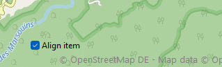
En pratique sous la VCL il vaut mieux utiliser un TPanel et y poser vos composants car ici le fond de la checkBox n'est pas modifié lorsque la carte bouge.
1function Add(const AMargin : integer; const AAlign : TECComponentAlign):TECComponent;
function IndexOf(const AName : string): integer;
procedure Remove(const AName : string);
procedure Remove(const AIndex : integer);
procedure Remove(const AComponent : TECComponent);
procedure Move(const CurIndex,NewIndex : integer);
procedure Clear
function Count : integer;
property Component[index:integer] : TECComponent default;
TECComponent
Encapsulage du TControl ancré sur la carte
procedure Removeprocedure Move(const NewIndex:integer)
property Name : string
property Component : TControl
property Align : TECComponentAlign
property Width : integer
property Height : integer
property Top : integer
property Left : integer
Top et Left ne sont utilisés que si l'alignement est ecNone
1property Opacity : single
Opacity varie de 0 à 1 (0.5 = 50%) et n'est disponible que sous Firemonkey
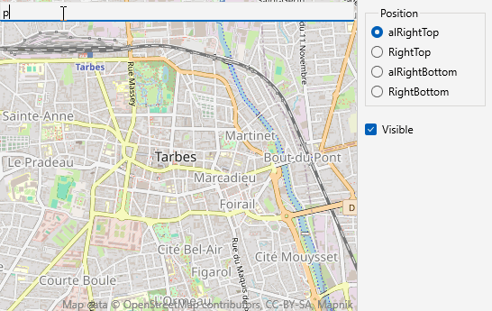
2TECComponentAlign
Les composants peuvent être aligner sur les quatres bordures de la carte
ecTopRight , ecTopLeft empile les composants verticalement vers le haut à droite et à gauche
ecBottomRight, ecBottomLeft empilent les composants verticalement vers le bas à droite et à gauche
ecRightTop , ecLeftTop empilent les composants horizontalement vers le haut à droite et à gauche
ecRightBottom, ecLeftBottom empilent les composants horizontalement vers le bas à droite et à gauche
ecTopCenter, ecBottomCenter, ecLeftCenter, ecRightCenter centrer le composant sur une des 4 bordures
Sont aussi disponible : ecAlTopLeft,ecAlTopRight,ecAlBottomLeft,ecAlBottomRight,ecAlLeftTop, ecAlRightTop, ecAlLeftBottom, ecAlRightBottom
1Les empilements sont les même mais le composant va occuper toute la place disponible jusqu'au bord de l'écran.
2Création d'une barre de zoom
L'unité uecNativeMapControl déclare la classe TECCustomTool elle vous servira d'ancêtre pour vos composants
TECCustomTool
procedure Add(const Name : String; const AComponent : TControl; const AAlign : TECComponentAlign);
property Align : TECComponentAlign
property Component : TECComponent
property Map : TNativeMapControl
property Layout : TECCustomToolLayout
property Width : integer
property Height : integer
property Opacity : single
property Visible: boolean
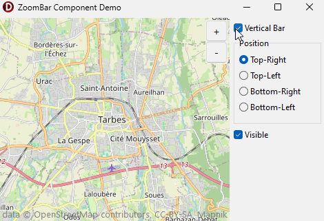
Composant ZoomBar
L'unité uecZoomBarComponent (FMX.uecZoomBarComponent) vous montre comment créé un composant composé de plusieurs controles Delphi, la démo BarZoom montre son utilisation
interface
uses
Windows, messages,forms,sysutils,Classes, Graphics, Controls, StdCtrls, ExtCtrls,
uecNativeMapControl,uecMapUtil;
type
TZoomBarComponent = class(TECCustomTool)
private
tmZoom : TTimer;
FPanelBar : TPanel;
FNextZoom ,
FPrevZoom : Tbutton;
FButtonSize : integer;
FVerticalBar: boolean;
FInProgressiveZoom,
FProgressiveZoom : boolean;
procedure setProgressiveZoom(const value:boolean);
procedure setButtonSize(const value:integer);
procedure doNextZoom(Sender:TObject);
procedure doPrevZoom(Sender:TObject);
procedure doNextMouseDown(Sender: TObject; Button: TMouseButton;Shift: TShiftState; X, Y: integer);
procedure doNextMouseUp(Sender: TObject; Button: TMouseButton;Shift: TShiftState; X, Y: integer);
procedure tmZoomTimer(Sender: TObject);
procedure ChangeZoom;
protected
procedure setLayout(const value:TECCustomToolLayout); override;
public
constructor Create(Map : TNativeMapControl); override;
destructor Destroy; override;
property ButtonSize : integer read FButtonSize write setButtonSize;
property ProgressiveZoom : boolean read FProgressiveZoom write setProgressiveZoom;
end;
implementation
constructor TZoomBarComponent.Create(Map : TNativeMapControl);
begin
inherited;
// create zoom bar
// FPanelBar will be the support that determines the total occupancy of our component
// It will be connected to TECNativeMap
FPanelBar := TPanel.Create(nil);
FPanelBar.BevelOuter := bvNone;
FPanelBar.ParentBackground := false;
FPanelBar.Color := clBtnFace;
FPanelBar.showHint := true;
// place buttons on the panel
FNextZoom := TButton.Create(FPanelBar);
FNextZoom.Parent := FPanelBar;
FNextZoom.Caption:= '+';
FNextZoom.Hint := doubleToStrDigit(map.NumericalZoom,1);
FNextZoom.font.size := 11;
FNextZoom.onClick := doNextZoom;
FPrevZoom := TButton.Create(FPanelBar);
FPrevZoom.Parent := FPanelBar;
FPrevZoom.Caption:= '-';
FPrevZoom.Hint := doubleToStrDigit(map.NumericalZoom,1);
FPrevZoom.font.size := 11;
FPrevZoom.onClick:= doPrevZoom;
// Anchoring the panel on the map
add('ZoomBar',FPanelBar,ecTopRight);
ButtonSize := 32;
// A timer is used to manage the progressive zoom
// triggered when a zoom button is pressed.
tmZoom := TTimer.Create(nil);
tmZoom.Enabled := false;
tmZoom.Interval := 80;
tmZoom.OnTimer := tmZoomTimer;
ProgressiveZoom := true;
end;
procedure TZoomBarComponent.setProgressiveZoom(const value:boolean);
begin
FProgressiveZoom := value;
if value then
begin
FNextZoom.OnMouseDown := doNextMouseDown;
FNextZoom.OnMouseUp := doNextMouseUp;
FPrevZoom.OnMouseDown := doNextMouseDown;
FPrevZoom.OnMouseUp := doNextMouseUp;
end
else
begin
FNextZoom.OnMouseDown := nil;
FNextZoom.OnMouseUp := nil;
FPrevZoom.OnMouseDown := nil;
FPrevZoom.OnMouseUp := nil;
end;
end;
procedure TZoomBarComponent.setButtonSize(const value:integer);
begin
FButtonSize := value;
FNextZoom.width := FButtonSize;
FNextZoom.Height := FButtonSize;
FPrevZoom.width := FButtonSize;
FPrevZoom.Height := FButtonSize;
// recalculate button layout
Layout:=Layout;
end;
procedure TZoomBarComponent.setLayout(const value:TECCustomToolLayout);
begin
inherited;
FNextZoom.Top := 0;
FNextZoom.Left := 0;
if (Layout=ctlVertical) then
begin
Width := FButtonSize;
Height := 2*FButtonSize-1;
FPrevZoom.Top := FButtonSize-1;
FPrevZoom.Left := 0;
end
else
begin
Width := 2*FButtonSize-1;
Height:= FButtonSize;
FPrevZoom.Top := 0;
FPrevZoom.Left := FButtonSize-1;
end;
end;
procedure TZoomBarComponent.ChangeZoom;
begin
FNextZoom.Hint := doubleToStrDigit(map.NumericalZoom,1);
FPrevZoom.Hint := doubleToStrDigit(map.NumericalZoom,1);
end;
procedure TZoomBarComponent.doNextZoom(Sender:TObject);
begin
if not FInProgressiveZoom then
begin
Map.Zoom := Map.Zoom + 1;
ChangeZoom;
end;
FInProgressiveZoom := false;
end;
procedure TZoomBarComponent.doPrevZoom(Sender:TObject);
begin
if not FInProgressiveZoom then
begin
Map.Zoom := Map.Zoom - 1;
ChangeZoom;
end;
FInProgressiveZoom := false;
end;
// activate the timer when the button is pressed
// a progressive zoom will then be automatically performed
procedure TZoomBarComponent.doNextMouseDown(Sender: TObject; Button: TMouseButton;
Shift: TShiftState; X, Y: integer);
begin
// save the button pressed to react on it.
tmZoom.Tag := integer(Sender);
tmZoom.Enabled := true;
end;
// cancel progressive zoom
procedure TZoomBarComponent.doNextMouseUp(Sender: TObject; Button: TMouseButton;
Shift: TShiftState; X, Y: integer);
begin
tmZoom.Enabled := false;
ChangeZoom;
end;
// Progressive zoom in or out
// Allows to go beyond the maximum zoom managed by the tile server
procedure TZoomBarComponent.tmZoomTimer(Sender: TObject);
begin
FInProgressiveZoom := true;
if (TButton(tmZoom.Tag) = FNextZoom) then
begin
map.ZoomScaleFactor := map.ZoomScaleFactor + 10
end
else
map.ZoomScaleFactor := map.ZoomScaleFactor - 10;
end;
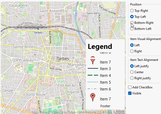
Composant Légende
L'unité uecLegendPanel (FMX.uecLegendPanel) permet la gestion d'une légende pour votre carte.
public
property Legend : TPanelLegend ;
end;
TPanelLegend
function Add(const ACaption:string;const AColor:TColor;const AStyle:TVisualStyle=vsFrame;const AObject:TObject=nil):TItemLegend;
function Add(const ACaption:string;const AGraphic:TGraphic;const AObject:TObject=nil):TItemLegend;
procedure Delete(index:integer);
property Count : integer
property Items[Index:integer] : TItemLegend
property VisualAlignment : TVisualAlignmentproperty VisualWidth : integer
property VisualWeight : integer
property ItemAlignment : TAlignment
property ItemCheckBox : boolean
property ItemHeight : integer
property ItemFontSize : integer
property TitleFontSize : integer
property FooterFontSize: integer
property FontName : string
property FontColor: TColor
property Title : string
property TitleAlignment : TAlignment
property Footer : string
property FooterAlignment : TAlignment
property OnItemClick : TNotifyEvent
property OnItemCheckBoxChange : TNotifyEvent
TItemLegend
property ItemColor : TColorproperty ItemChecked : boolean
property ItemCheckBox: boolean
property ItemBorderColor : TColor
property ItemCaption : String
property ItemGraphic : TGraphic
property ItemVisualStyle : TVisualStyle
property ItemVisualWidth : integer
property ItemVisualWeight: integer
property ItemVisualAlignment : TVisualAlignment
property ItemAlignment : TAlignment
property ItemFontSize : integer
property ItemFontName : string
property ItemFontColor : TColor
property ItemHeight: integer
property ItemObject : TObject
begin
FLegendCp := TLegendComponent.Create(map);
FLegendCp.Legend.color := clWhite;
FLegendCp.Legend.Height:= 270;
// add checkbox
FLegendCp.Legend.ItemCheckBox := true;
// The event is triggered OnItemCheckBoxChange when the checkbox changes state
FLegendCp.Legend.OnItemCheckBoxChange := doOnItemLegendCheckBoxChange;
// width of legend pictogram
FLegendCp.Legend.VisualWidth := 40;
// line thickness for styles <> vsFrame and vsFillRect
FLegendCp.Legend.VisualWeight := 3;
FLegendCp.Legend.add('Item 1',getRandomColor,vsFillRect);
FLegendCp.Legend.add('Item 2',getRandomColor,vsFrame);
FLegendCp.Legend.add('Item 3',getRandomColor,vsSolidLine);
FLegendCp.Legend.add('Item 4',getRandomColor,vsDashLine);
FLegendCp.Legend.add('Item 5',getRandomColor,vsDotLine);
FLegendCp.Legend.add('Item 6',getRandomColor,vsDashDotLine);
// add graphic
FLegendCp.Legend.add('Item 7',pins.picture.graphic);
FLegendCp.Legend.Title := 'Legend';
FLegendCp.Legend.Footer := 'Footer';
FLegendCp.Legend.OnItemClick := doOnItemLegendClick;
end;
procedure TFormLegend.FormDestroy(Sender: TObject);
begin
FLegendCp.Free;
end;
procedure TFormLegend.ckVisibleClick(Sender: TObject);
begin
FLegendCp.Visible := ckVisible.Checked;
end;
// event triggered by a click on an item
procedure TFormLegend.doOnItemLegendClick(sender : TObject);
begin
if Sender is TItemLegend then
begin
showMessage(TItemLegend(Sender).ItemCaption);
end;
end;
// event triggered by a click on an item checkbox
procedure TFormLegend.doOnItemLegendCheckBoxChange(sender : TObject);
var s:string;
begin
if Sender is TItemLegend then
begin
if TItemLegend(Sender).ItemChecked then
s := ' is checked'
else
s := ' is not checked';
showMessage(TItemLegend(Sender).ItemCaption+s);
end;
end;
(*
ecTopRight , ecTopLeft stacks components vertically upwards to right and left
ecBottomRight, ecBottomLeft stack components vertically downwards on right and left
ecRightTop , ecLeftTop stack components horizontally upwards to right and left
ecRightBottom, ecLeftBottom stacks components horizontally downwards to right and left
*)
procedure TFormLegend.RadioButton4Click(Sender: TObject);
begin
case TRadioButton(Sender).tag of
0 : FLegendCp.Align := ecTopRight;
1 : FLegendCp.Align := ecTopLeft;
2 : FLegendCp.Align := ecBottomRight;
3 : FLegendCp.Align := ecBottomLeft;
end;
end;
// item text alignment
procedure TFormLegend.RadioButton8Click(Sender: TObject);
begin
case TRadioButton(Sender).tag of
0 : FLegendCp.Legend.ItemAlignment := taLeftJustify;
1 : FLegendCp.Legend.ItemAlignment := taCenter;
2 : FLegendCp.Legend.ItemAlignment := taRightJustify;
end;
end;
// item visual alignment
procedure TFormLegend.RadioButton9Click(Sender: TObject);
begin
case TRadioButton(Sender).tag of
0 : FLegendCp.Legend.VisualAlignment := valLeft;
1 : FLegendCp.Legend.VisualAlignment := valRight;
end;
end;
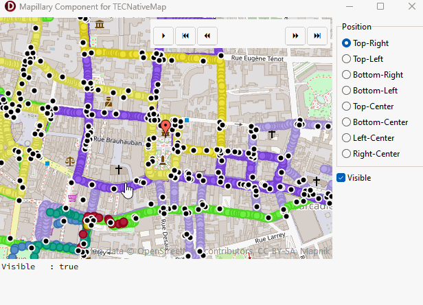
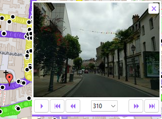
Composant Mapillary
L'unité uecMapillaryComponent (FMX.uecMapillaryComponent) prend en charge l'affichage du layer Mapillary et offre un aperçu des images.
begin
// Pass the map that will display the Mapillary component
FMapillaryComponent := TMapillaryComponent.Create(map);
// color component
FMapillaryComponent.Color := clWhite;
// Triggered when a Mapillary image is displayed
FMapillaryComponent.OnImage := doOnImage;
// Triggered when component state, visibility, position, size change
FMapillaryComponent.OnChange:= doOnChange;
// FPosition will indicate the position of the displayed Mapillary image
FPosition := map.AddMarker(map.Latitude, map.Longitude);
FPosition.Visible := false;
FPosition.filename := GOOGLE_RED_DOT_ICON; // unit uecMapUtil also BLUE,YELLOW and GREEN
FPosition.YAnchor := 32;
// Enter your access key, see https://www.mapillary.com/developer
FMapillaryComponent.AccessToken := 'ENTER-YOUR-ACCESS-TOKEN';
FMapillaryComponent.visible := true;
end;
// Triggered when component state, visibility, position, size change
procedure TMapillaryForm.doOnChange(Sender:TObject);
begin
ckVisible.Checked := FMapillaryComponent.visible;
FPosition.Visible := FMapillaryComponent.visible;
with Memo1.Lines do
begin
BeginUpdate;
Clear;
add('Visible : '+BoolToStr(FMapillaryComponent.visible));
EndUpdate;
end
end;
// Triggered when a Mapillary image is displayed
procedure TMapillaryForm.doOnImage(Sender:TObject);
begin
if assigned(FMapillaryComponent.Image) then
begin
FPosition.SetPosition(FMapillaryComponent.Image.lat,FMapillaryComponent.Image.lng);
FPosition.setFocus;
with Memo1.Lines do
begin
BeginUpdate;
Clear;
add('Lat : '+doubleToStrDigit(FMapillaryComponent.Image.lat, 4));
add('Lng : '+doubleToStrDigit(FMapillaryComponent.Image.lng, 4));
add('Angle : '+inttostr(FMapillaryComponent.Image.Compass_angle)+ '°');
add('Time : '+DateTimeToStr(FMapillaryComponent.Image.Captured_at));
EndUpdate;
end;
end
else
Memo1.Lines.Clear;
end;
procedure TMapillaryForm.FormDestroy(Sender: TObject);
begin
FMapillaryComponent.Free;
end;
procedure TMapillaryForm.ckVisibleClick(Sender: TObject);
begin
FMapillaryComponent.Visible := ckVisible.Checked;
end;
procedure TMapillaryForm.RadioButton4Click(Sender: TObject);
begin
case TRadioButton(Sender).tag of
0 : FMapillaryComponent.Align := ecTopRight;
1 : FMapillaryComponent.Align := ecTopLeft;
2 : FMapillaryComponent.Align := ecBottomRight;
3 : FMapillaryComponent.Align := ecBottomLeft;
4 : FMapillaryComponent.Align := ecTopCenter;
5 : FMapillaryComponent.Align := ecBottomCenter;
6 : FMapillaryComponent.Align := ecLeftCenter;
7 : FMapillaryComponent.Align := ecRightCenter;
end;
end;
TMapillaryComponent
property AccessToken : stringLa propriété est valide après l'événement OnImage
Couleur des glyphes des boutons
procedure TMapillaryForm.doOnImage(Sender:TObject);
begin
if assigned(FMapillaryComponent.Image) then
begin
// Match button color to image sequence color
FMapillaryComponent.ColorGlyph := FMapillaryComponent.Sequence.Color;
...
end;
end;
La propriété est valide après l'événement OnImage
Image = nil si aucune image n'est sélectionnée
2property CloseHint: string
property RunHint: string
property PauseHint: string
property FirstHint: string
property PrevHint: string
property NextHint: string
property LastHint: string
property CloseGlyph: string
property RunGlyph: string
property PauseGlyph: string
property FirstGlyph: string
property PrevGlyph: string
property NextGlyph: string
property LastGlyph: string
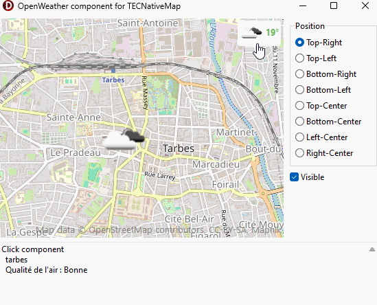
Composant OpenWeather
Affichage de la météo locale en utilisant les services de openweathermap.org, en option vous pouvez aussi indiquer la qualité de l'air avec les données du projet World Air Quality Index
La couleur de la température indique la qualité de l'air
begin
// get your key from http://openweathermap.org/appid
map.OpenWeather.Key := 'ENTER-YOUR-KEY';
// Air quality is optional, leave the key empty if you don't want to use it.
// get your free key from https://aqicn.org/data-platform/token/
map.AirQuality.key := 'ENTER-YOUR-KEY';
FOpenWeatherComponent := TOpenWeatherComponent.Create(Map);
FOpenWeatherComponent.Color := clWhite;
// The component is only displayed for zoom 13 and above.
FOpenWeatherComponent.MinZoom := 13;
/// Triggered by clicking on component or map marker
FOpenWeatherComponent.OnClick := doOnClick;
// Triggered by change of weather station
FOpenWeatherComponent.OnChange:= doOnChange;
// You can specify the language for the weather description
map.openWeather.Lang := 'fr';
// Translate the hint for "Air quality".
FOpenWeatherComponent.HintAirQuality := 'Qualité de l''air';
// You can also translate the table containing the air quality indicators
Map.AirQuality.Legend[aqlGood] := 'Bonne';
Map.AirQuality.Legend[aqlModerate] := 'Modérée';
Map.AirQuality.Legend[aqlUnhealthySensitive] := 'Insalubre pour les groupes sensibles';
Map.AirQuality.Legend[aqlUnhealthy] := 'Insalubre';
Map.AirQuality.Legend[aqlVeryUnhealthy] := 'Nocive';
Map.AirQuality.Legend[aqlHazardous] := 'Dangereuse';
FOpenWeatherComponent.visible := true;
// DateTimeIndex from 0 to 39 to select date and time in 3-hour increments
// 0 = now
// 1 = now + 3 hours
// 8 = tomorrow at the same time
FOpenWeatherComponent.DateTimeIndex := 0;
end;
// Triggered by change of weather station
procedure TFormWeather.doOnChange(sender : TObject);
begin
with Memo1.Lines do
begin
BeginUpdate;
Clear;
Add(FOpenWeatherComponent.Station.Name);
Add('Temp : '+DoubleToStr(round(FOpenWeatherComponent.Station.temp))+ '°'+
' (min: '+doubletostr(round(FOpenWeatherComponent.Station.temp_min))+ '°'+
' max: '+doubletostr(round(FOpenWeatherComponent.Station.temp_max))+ '°)' );
Add(FOpenWeatherComponent.Station.weather.description) ;
if FOpenWeatherComponent.CityAirQuality.Ok then
Add(FOpenWeatherComponent.HintAirQuality+' '+Map.AirQuality.Legend[FOpenWeatherComponent.CityAirQuality.level]);
EndUpdate;
end;
end;
// Triggered by clicking on component or map marker
procedure TFormWeather.doOnClick(sender : TObject);
var Q:string;
begin
(*
OnClick reacts both to the click on the component and to the marker on the map
Sender makes it possible to distinguish between them
*)
if not (Sender is TECShape) then
// compact or full display
FOpenWeatherComponent.ShowDescription := not FOpenWeatherComponent.ShowDescription;
if FOpenWeatherComponent.CityAirQuality.Ok then
begin
Q := FOpenWeatherComponent.HintAirQuality;
if Q<>'' then Q := Q + ' : ';
Q := Q + Map.AirQuality.Legend[FOpenWeatherComponent.CityAirQuality.level];
end
else
Q := '';
Memo1.Lines.Clear;
Memo1.Lines.Add('Click component');
Memo1.Lines.Add(' '+FOpenWeatherComponent.Station.name);
if Q<>'' then
Memo1.Lines.Add(' '+Q);
end;
procedure TFormWeather.ckVisibleClick(Sender: TObject);
begin
FOpenWeatherComponent.Visible := ckVisible.Checked;
end;
procedure TFormWeather.RadioButton4Click(Sender: TObject);
begin
case TRadioButton(Sender).tag of
0 : FOpenWeatherComponent.Align := ecTopRight;
1 : FOpenWeatherComponent.Align := ecTopLeft;
2 : FOpenWeatherComponent.Align := ecBottomRight;
3 : FOpenWeatherComponent.Align := ecBottomLeft;
4 : FOpenWeatherComponent.Align := ecTopCenter;
5 : FOpenWeatherComponent.Align := ecBottomCenter;
6 : FOpenWeatherComponent.Align := ecLeftCenter;
7 : FOpenWeatherComponent.Align := ecRightCenter;
end;
end;
Composant Switch TileServer
L'unité uecSwitchServerComponent (FMX.uecSwitchServerComponent) défini un composant permettant de choisir entre deux serveurs de tuiles, vous pouvez en utiliser plusieurs
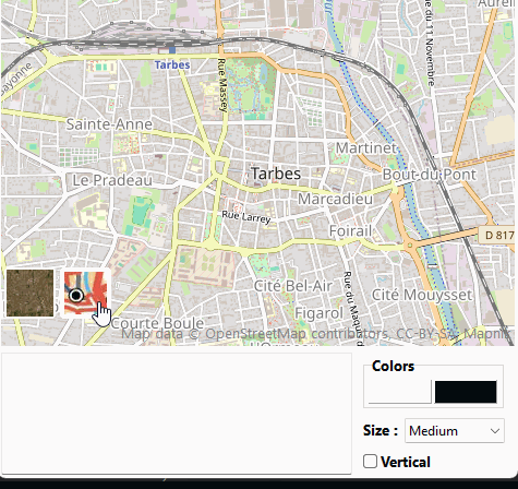
Consultez la démo pour apprendre à vous en servir.
begin
FSwitchServer := TSwitchServerComponent.create(map);
FSwitchServer.Visible := true;
// line useless because it is the default server, indicate for info
FSwitchServer.TileServer := tsArcGisWorldImagery;
// Triggered by switch click after server change
FSwitchServer.OnSwitch := doOnSwitch;
// Triggered especially when changing alignment and size
FSwitchServer.OnChange := doOnChange;
// Pass a name in addition (here '2') to be able to add another TSwitchServerComponent, otherwise the first one is reused.
FSwitchServer2 := TSwitchServerComponent.create(map,'2');
FSwitchServer2.Visible := true;
FSwitchServer2.OnSwitch := doOnSwitch;
FSwitchServer2.TileServer := tsIgn;
FSwitchServer2.MapStyle := 'SCAN';
// You can specify your own server like this
// FSwitchServer2.CustomTileServer := getTile;
pnColor.Color := FSwitchServer.Color;
pnSecondaryColor.Color := FSwitchServer.SecondaryColor;
end;
// build access to your own tiles here
procedure TFormSwitch.GetTile(var TileFilename: string; const x, y, z: Integer);
begin
TileFilename := Format('your_tile_url/%s%/%s/%s',[x,y,z]);
end;
procedure TFormSwitch.pnColorClick(Sender: TObject);
begin
if ColorDialog.Execute then
begin
TPanel(Sender).Color := ColorDialog.Color;
FSwitchServer.Color := pnColor.Color;
FSwitchServer.SecondaryColor := pnSecondaryColor.Color;
FSwitchServer2.Color := pnColor.Color;
FSwitchServer2.SecondaryColor := pnSecondaryColor.Color;
end;
end;
procedure TFormSwitch.cbSizeChange(Sender: TObject);
begin
case cbSize.ItemIndex of
0: FSwitchServer.size := 32;
1: FSwitchServer.size := 48;
2: FSwitchServer.size := 64;
end;
FSwitchServer2.size := FSwitchServer.size ;
end;
procedure TFormSwitch.doOnSwitch(Sender : TObject);
begin
memo1.Lines.Add(TSwitchServerComponent(Sender).Name + ' -> '+tsToString(map.TileServer)+' '+map.TileServerInfo.MapStyle) ;
end;
// button stacking direction
procedure TFormSwitch.ckVerticalClick(Sender: TObject);
begin
if ckVertical.Checked then
begin
// from bottom to top on left side
FSwitchServer.Align := ecBottomLeft;
FSwitchServer2.Align := ecBottomLeft;
end
else
begin
// from left to right at the bottom of the screen
FSwitchServer.Align := ecLeftBottom;
FSwitchServer2.Align := ecLeftBottom;
end;
end;
// Triggered especially when changing alignment and size
procedure TFormSwitch.doOnChange(Sender : TObject);
var sAlign : string;
begin
if TSwitchServerComponent(Sender).Align=ecLeftBottom then
sAlign := ' Align : LeftBottom'
else
sAlign := ' Align : BottomLeft';
memo1.Lines.Add('Size : '+inttostr(TSwitchServerComponent(Sender).size)+sAlign) ;
end;
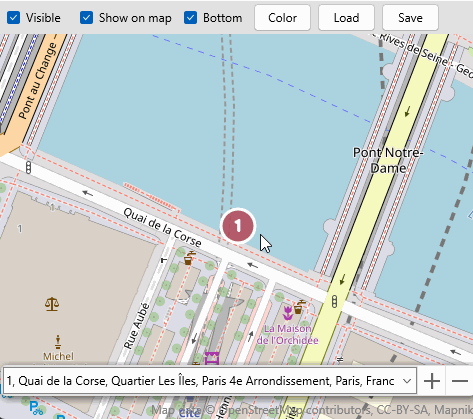
Composant BookMark
L'unité uecBookMarkComposant (FMX.uecBookMarkComposant) crée un composant permettant de gérer des bookmarks.
procedure SaveToFile(const filename: TFilename);
function LoadFromFile(const filename: TFilename): boolean;
property Color: TColor
property Group: TECShapes
property Selected : integer
property OnChange: TNotifyEvent
begin
FBookMarkComponent := TBookMarkComponent.Create(map);
// display bookmark bar
FBookMarkComponent.Visible := ckVisible.IsChecked;
// show bookmarks on map
FBookMarkComponent.Group.Visible := ckShowOnMap.IsChecked;
// triggered if visible, position or bookmarks change
FBookMarkComponent.OnChange := doOnchange;
end;
procedure TFormBookMark.FormDestroy(Sender: TObject);
begin
FBookMarkComponent.Free;
end;
procedure TFormBookMark.doOnchange(Sender: TObject);
begin
if FBookMarkComponent.visible then
FBookMarkComponent.Group.Visible := ckShowOnMap.IsChecked;
end;
procedure TFormBookMark.ckVisibleChange(Sender: TObject);
begin
FBookMarkComponent.Visible := ckVisible.IsChecked;
end;
procedure TFormBookMark.ckShowOnMapChange(Sender: TObject);
begin
FBookMarkComponent.Group.Visible := ckShowOnMap.IsChecked;
end;
procedure TFormBookMark.ckTopBottomChange(Sender: TObject);
begin
if ckTopBottom.IsChecked then
FBookMarkComponent.Align := ecAlRightBottom
else
FBookMarkComponent.Align := ecAlRightTop;
end;
procedure TFormBookMark.LoadClick(Sender: TObject);
begin
FBookMarkComponent.LoadFromFile(ExtractfilePath(ParamStr( 0)) +
'bookmark.txt');
end;
procedure TFormBookMark.SaveClick(Sender: TObject);
begin
FBookMarkComponent.SaveToFile(ExtractfilePath(ParamStr( 0)) + 'bookmark.txt');
end;
procedure TFormBookMark.RandomColorClick(Sender: TObject);
begin
FBookMarkComponent.Color := GetRandomcolor;
end;
Composant AddressEdit
L'unité AddressEditComponent (FMX.AddressEditComponent) crée un composant pour sélectionner une adresse
begin
FAddressEditComponent := TAddressEditComponent.Create(map);
// Triggered after selecting an address, allows you to refuse it
FAddressEditComponent.OnAddress := doOnAddress;
// triggered when align, visible, size properties are modified
FAddressEditComponent.onChange := doOnChange;
// true is default, here it's used to trigger Onchange
FAddressEditComponent.visible := true;
// 'Address' is the default value
FAddressEditComponent.TextHint := 'Address';
end;
procedure TFormAddressEditComponent.FormDestroy(Sender: TObject);
begin
FAddressEditComponent.Free;
end;
procedure TFormAddressEditComponent.doOnChange(Sender : TObject);
begin
ckVisible.IsChecked := FAddressEditComponent.Visible;
end;
procedure TFormAddressEditComponent.doOnAddress(const Address : string; const Latitude, Longitude: double; var Accept : boolean) ;
begin
// set Accept to false not to change address
end;
procedure TFormAddressEditComponent.ckVisibleChange(Sender: TObject);
begin
FAddressEditComponent.Visible := ckVisible.IsChecked;
end;
procedure TFormAddressEditComponent.AlignChange(Sender: TObject);
begin
case TRadiobutton(Sender).tag of
// takes up all the remaining space at the top from the right
0: FAddressEditComponent.Align := ecAlRightTop;
// takes up half the width of the map, top right
1: begin
FAddressEditComponent.Align := ecRightTop;
FAddressEditComponent.Width := trunc(map.Width / 2);
end;
// takes up all the remaining space at the bottom from the right
2: FAddressEditComponent.Align := ecAlRightBottom;
// takes up half the width of the map, bottom right
3: begin
FAddressEditComponent.Align := ecRightBottom;
FAddressEditComponent.Width := trunc(map.Width / 2);
end;
end;
end;
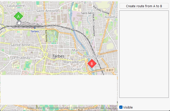
Composant AltGraph
Ce composant affiche le profil altimétrique d'une ligne sous la forme d'un graphique
procedure TFormAltGraph.FormCreate(Sender: TObject);
begin
// doOnAddRoute will be called when the route has been calculated
Map.Routing.OnAddRoute := doOnAddRoute;
// By default, the routing engine is reOpenStreetMap.
//Map.Routing.engine(reValhalla);
// PA and PB will be used to define the starting and ending points of the route.
PA := Map.AddPOI(Map.Latitude, Map.Longitude);
PA.POIShape := poiDiamond;
PA.Draggable := true;
PA.Description := 'A';
PA.WithEgalHeight := true;
PA.Width := 48;
PA.YAnchor := 24;
PB := Map.AddPOI(Map.Latitude, Map.Longitude+0.0005);
PB.POIShape := poiDiamond;
PB.Draggable := true;
PB.WithEgalHeight := true;
PB.Width := 48;
PB.YAnchor := 24;
PB.Description := 'B';
// Enable label display for points
// By default, the Description field is used as the content source.
Map.Shapes.Pois.Labels.Visible := true;
Map.Shapes.Pois.Labels.Style := lsTransparent;
Map.Shapes.Pois.Labels.Align := lacenter;
Map.Shapes.Pois.Labels.ColorType := lcContrasting;
Map.Shapes.Pois.Labels.fontsize := 11;
// Creation of the AltGraph component
FAltCmp := TAltGraphComponent.Create(Map);
ckVisible.Checked := true;
// Triggered before the altitude calculation request
FAltCmp.Graph.OnBeginAltitude := doOnBeginAltitudes;
// Triggered when altitudes are available
FAltCmp.Graph.OnAltitude := doOnAltitudes;
// Triggered when a point is hovered over, whether on the chart or on the line
FAltCmp.Graph.OnHoverPoint := doOnHoverPoint;
// Triggered when a point is clicked, whether on the chart or on the line
FAltCmp.Graph.OnClickPoint := doOnClickPoint;
// Triggered when leaving the chart or line
FAltCmp.Graph.OnLeavePoint := doOnLeavePoint;
(*
FAltCmp.Graph.Graph allows you to style the graph
BackGroundColor (white), GraphColor (red), AxeColor (black)
FontSize (default 12 under FMX and 9 with VCL
MaxTickX, MaxTickY number of graduations on the axes (default 8 and 4)
AltLegende (default 'Altitude in m')
DistLegende (default 'Distance in KM')
*)
end;
procedure TFormAltGraph.FormDestroy(Sender: TObject);
begin
FAltCmp.Free;
end;
procedure TFormAltGraph.ckVisibleClick(Sender: TObject);
begin
FAltCmp.visible := ckVisible.Checked;
end;
// Request to calculate the route between points A and B
procedure TFormAltGraph.btAddRouteClick(Sender: TObject);
begin
btAddRoute.Enabled := false;
Map.Routing.Request([PA.Latitude, PA.Longitude, PB.Latitude, PB.Longitude]);
end;
// The route (sender) has been calculated and displayed on the map.
procedure TFormAltGraph.doOnAddRoute(sender: TECShapeLine; const params: string);
begin
sender.ShowText := false;
sender.Hint := 'Click for select';
sender.color := getRandomPastelColor;
// triggered by clicking on the line
sender.OnShapeClick := doOnLineClick;
(*
The profile will not be calculated directly on the points of the line,
but a fictitious line will be superimposed on it,
with all points approximately AltitudeSegmentLength meters apart.
This allows for a more harmonious graph.
default FAltCmp.Graph.AltitudeSegmentLength = 250 meters
*)
// Displaying the line profile
FAltCmp.Graph.Line := sender;
// The graph will take on the color of the line. You can change it like this.
// FAltCmp.Graph.graph.GraphColor := clGreen;
end;
// Displaying the line profile
procedure TFormAltGraph.doOnLineClick(sender: TObject; const item: TECShape);
begin
FAltCmp.Graph.Line := TECShapeLine(item);
end;
procedure TFormAltGraph.doOnLeavePoint(sender: TObject);
begin
info.caption := '';
end;
procedure TFormAltGraph.doOnHoverPoint(const sender: TObject; const Latitude,Longitude, Km : double; const Altitude : integer);
begin
info.caption := 'Hover : '+doubletostrDigit(Latitude,4)+' '+doubletostrDigit(Longitude,4)
+#13#10+doubletostrDigit(Km,2)+' Km '+inttostr(Altitude)+' m';
end;
procedure TFormAltGraph.doOnClickPoint(const sender: TObject; const Latitude,Longitude, Km : double; const Altitude : integer);
begin
info.caption := 'Click : '+doubletostrDigit(Latitude,4)+' '+doubletostrDigit(Longitude,4)
+#13#10+doubletostrDigit(Km,2)+' Km '+inttostr(Altitude)+' m';
end;
procedure TFormAltGraph.doOnBeginAltitudes(sender: TObject);
begin
LB.items.clear;
LB.items.Add('waiting altitudes...');
end;
// Altitudes are available, sender = FAltCmp.Graph
procedure TFormAltGraph.doOnAltitudes(sender: TObject);
var
i: integer;
L: TECShapeLine;
D: Double;
begin
btAddRoute.Enabled := true;
if not (sender is TECAltitudeGraph ) then
exit;
// AltitudeLine is the imaginary line where all points
// are TECAltitudeGraph(sender).AltitudeSegmentLength apart from each other.
L := TECAltitudeGraph(sender).AltitudeLine;
LB.items.BeginUpdate;
LB.items.clear;
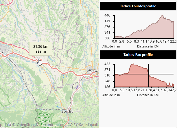
LB.items.Add('Distance : '+doubletostr(L.Distance)+' km');
for i := 0 to L.Count - 1 do
begin
D := (L.Path[i].Distance);
LB.items.Add(doubletostr(D / 1000) + ' km : ' + doubletostr(L.Path[i].Alt)+' m');
end;
LB.items.EndUpdate;
end;
TECAltitudeGraph
Cette classe ( unit ecAltGraph ) vous permet d'afficher un profil altimétrique a coté de votre carte
procedure TFMultiGraph.FormCreate(Sender: TObject);
begin
FGraphA := TECAltitudeGraph.Create(Map,ViewGraphA);
// Triggered before the altitude calculation request
FGraphA.OnBeginAltitude := doOnBeginAltitudes;
// Triggered when altitudes are available
FGraphA.OnAltitude := doOnAltitudes;
FGraphB := TECAltitudeGraph.Create(Map,ViewGraphB);
FGraphB.OnBeginAltitude := doOnBeginAltitudes;
FGraphB.OnAltitude := doOnAltitudes;
// doOnAddRoute will be called when the route has been calculated
Map.Routing.OnAddRoute := doOnAddRoute;
// By default, the routing engine is reOpenStreetMap.
//Map.Routing.engine(reValhalla);
FLineA := map.addLine;
FLineA.tag := 0;
FLineB := map.addLine;
FLineB.tag := 1;
LabelA.Caption := 'Waiting for the road';
LabelB.Caption := 'Waiting for the road';
Map.Routing.Request('Tarbes','Lourdes', FLineA);
Map.Routing.Request('Tarbes','Pau', FLineB);
end;
procedure TFMultiGraph.FormDestroy(Sender: TObject);
begin
FGraphA.free;
FGraphB.Free;
end;
// The road is available
procedure TFMultiGraph.doOnAddRoute(sender: TECShapeLine; const params: string);
begin
sender.ShowText := false;
sender.color := getRandomPastelColor;
// Adjust the map zoom to see the entire route
sender.fitBounds;
case sender.tag of
0 : FGraphA.Line := Sender;
1 : FGraphB.Line := Sender;
end;
end;
// The request to obtain the altitudes will be launched.
procedure TFMultiGraph.doOnBeginAltitudes(sender: TObject);
begin
if sender is TECAltitudeGraph then
begin
if TECAltitudeGraph(sender)=FGraphA then
LabelA.caption := 'Awaiting profile'
else
if TECAltitudeGraph(sender)=FGraphB then
LabelB.caption := 'Awaiting profile'
end;
end;
// The altitudes have been obtained and the profile is displayed.
procedure TFMultiGraph.doOnAltitudes(sender: TObject);
begin
if sender is TECAltitudeGraph then
begin
if TECAltitudeGraph(sender)=FGraphA then
LabelA.caption := 'Tarbes-Lourdes profile'
else
if TECAltitudeGraph(sender)=FGraphB then
LabelB.caption := 'Tarbes-Pau profile'
end;
end;